PYTHON
프로젝트 회고 | Kaggle 스타벅스 마케팅 데이터 분석 : 데이터 EDA
성장하는 쿠키의 로그 기록
2025. 1. 5. 17:26
프로젝트 | Kaggle 스타벅스 마케팅 데이터 분석2 : 데이터 전처리
프로젝트 | Kaggle 스타벅스 마케팅 데이터 분석 : 분석 개요1. 분석 개요 ☑️ 분석 목적 Starbucks Customer DataStarbucks customer datasetwww.kaggle.comKaggle 에서 제공되는 'Starbucks Customer Data' 의 고객/ 프로모
cookievlog.tistory.com
↑ 이 후 본격적으로 데이터 EDA 진행
3. 데이터 EDA
☑️ Profile (고객 정보 테이블)
- 연령별 고객 비중 : 주 고객은 50-60대 , 70대 이상 노년층 고객 비중도 높음 반면 1030 고객 비중이 낮은편
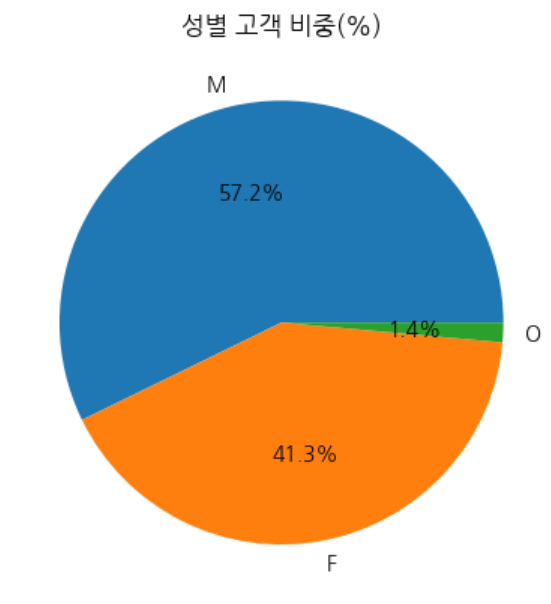
- 성별 고객 비중 : : 남성 > 여성
- 날짜별 가입자 수 추이 (년도별/년-월별) : 2013년 부터 지속 성장 추이를 보임, 17년 8월 기점으로 급등, 18-01월 전년 동월대비 +180% (2018 감소 처럼 보이는건, 2018-07 (3분기) 가입자 까지만 집계된 데이터이기 때문)
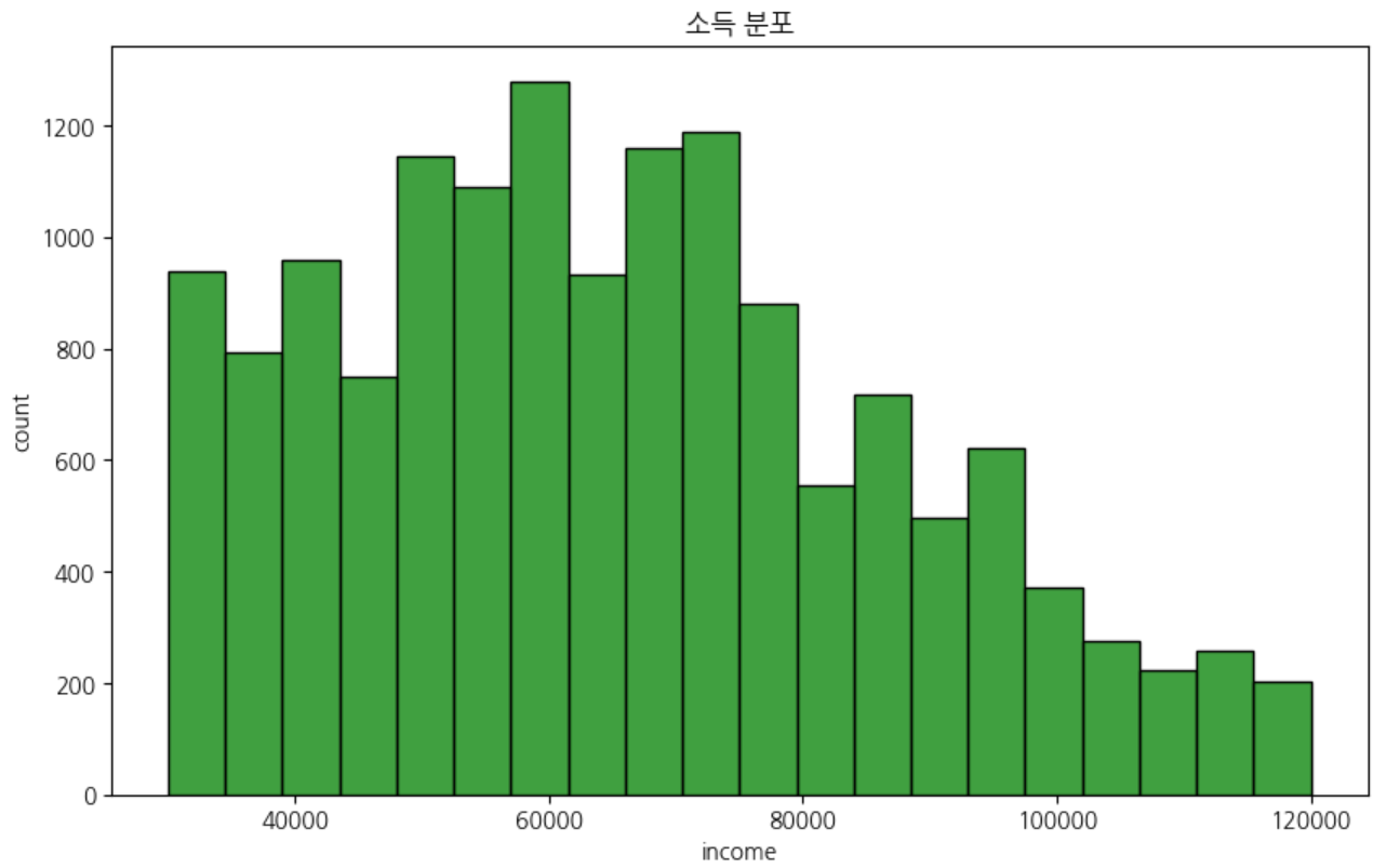
- 고객 소득 분포 : 주 고객의 소득수준은 5천~7.5천 사이
▼코드 보기
더보기
# 1.연령별 고객비중 (코드 - 나이 분류 후 진행)

#나이 분류 10대~70대이상(18-101)
bins_age = [0,29, 39, 49, 59, 69, 120]  # 구간 설정
labels_age = ['20대이하', '30대', '40대','50대', '60대', '70대 이상']
profile ['age_group'] = pd.cut(profile ['age'], bins=bins_age, labels=labels_age)

#연령별 고객 비중
age_cnts = profile['age_group'].value_counts().sort_index()
age_proportion = round(age_cnts / age_cnts.sum()*100,2).reset_index()
age_proportion

# 1-2. 연령대별 고객 비중 ( 바 그래프 )
plt.figure(figsize=(10, 6))
ax = sns.barplot(data=age_proportion,x='age_group',y='count')

# 그래프 위에 Y값 레이블 추가
for p in ax.patches:
    # 막대의 중심 위치 (x)와 높이 (y)
    x = p.get_x() + p.get_width() / 2
    y = p.get_height()
    ax.text(x, y + 0.3, f'{y:.1f}', ha='center')  # y값을 텍스트로 표시

#스타일 변경
plt.title('연령대별 고객 비중', fontsize=16)
plt.xlabel('연령대', fontsize=14)
plt.ylabel('비중 (%)', fontsize=14)
plt.xticks(rotation=45, fontsize=12)
plt.yticks(fontsize=12)
plt.tight_layout()

plt.show()
#2. 성별 고객 비중 ( 코드 )
#성별 고객 비중
gender_cnts = profile['gender'].value_counts()
gender_cnts = gender_cnts / gender_cnts.sum()*100
a = gender_cnts.reset_index()
#2-1. 성별 고객 비중 ( 파이차트 )
plt.pie(a['count'], labels=a['gender'], autopct='%.1f%%')
#스타일 변경
plt.title('성별 고객 비중(%)')
plt.show()# 3.년도별 가입자 수 (코드 - 년월/년도별)
profile['year'] = profile['became_member_on'].dt.year
profile['ymnth'] = profile['became_member_on'].dt.strftime('%Y-%m')
year_cnts = profile['year'].value_counts().sort_index().reset_index()
ymnth_cnts = profile['ymnth'].value_counts().sort_index().reset_index()
#3-1.년도별 (라인 차트)
ax = sns.lineplot(x='year',y='count',data=year_cnts ,color='orange',marker='o')
for x, y in zip(year_cnts['year'], year_cnts['count']):
ax.text(x, y + 2, f'{y:.0f}', ha='center', va='bottom', fontsize=10) # y값 표시
plt.title('년도별 가입자 수 추이')
plt.ylim(0,7000)
plt.show()
#3-2.년-월별 (바 차트)
plt.figure(figsize=(50, 6))
ax = sns.barplot(x='ymnth',y='count',data=ymnth_cnts)
for p in ax.patches:
# 막대의 중심 위치 (x)와 높이 (y)
x = p.get_x() + p.get_width() / 2
y = p.get_height()
ax.text(x, y + 2, f'{y:.0f}', ha='center') # y값을 텍스트로 표시
plt.show()#4. 고객 소득 분포 (히스토그램)
plt.figure(figsize=(10, 6))
sns.histplot(x='income', data=profile, color='green', bins=20)
plt.title("소득 분포")
plt.xlabel("income")
plt.ylabel("count")
plt.show()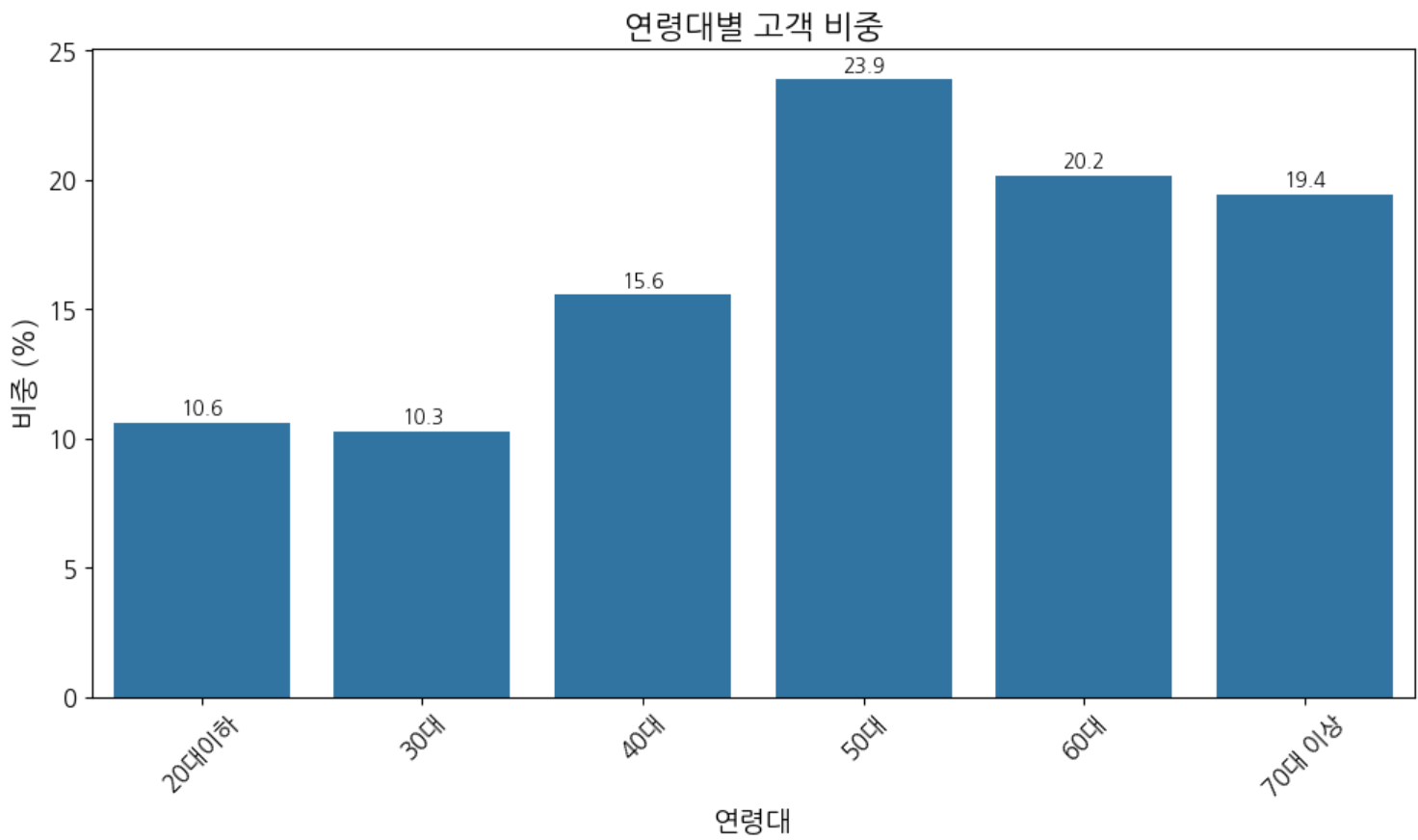


☑️ Portfolio (프로모션 정보 테이블)
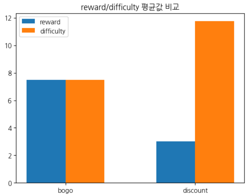
- 프로모션별 조건 관계 파악
- bogo프로모션이 수익 대비 비용이 클 가능성이 있음 (특히, discount 프로모션보다 reward가(비용) 2배 이상 높음 )
- 따라서, 고객은 discount 보다 bogo 프로모션에 더 반응할 가능성이 있겠음.(혜택이 더 크니까)
▼코드 보기
더보기
#프로모션별 숫자형 조건간의 관계
portfolio.groupby(['offer_type']).mean(numeric_only=True).sort_index().reset_index()

# 프로모션 조건간의 평균값 시각화( 바 차트 )
x = np.array(range(len(a['offer_type'])))
w = 0.3

plt.bar(x, a['reward'], width=w, label='reward')
x = x + w
plt.bar(x, a['difficulty'], width=w, label='difficulty')
plt.xticks(x - w / 2, a['offer_type'])
plt.title('reward/difficulty 평균값 비교')
plt.legend()
plt.show()
☑️ Transcript (고객 행동 정보 테이블)
- 시간별 event 횟수 : 특정 시각에 이벤트 발생 횟수가 두드러짐 → 확인 결과 해당 시각의 오퍼 발송 비중이 대부분
- 모든 오퍼의 발송(고객은 수신) 한 시각이 동일함 = 모든 프로모션의 발송 주기가 동일함. 한달에 6번 주기적으로 발송.
- 오퍼 발송시 평균 7,627명의 고객에게 발송. (각프로모션의 발송 횟수(타겟 고객 수 )동일
- event 발생 비중 : 거래 > 수신 > 조회 > 완료 , 해당 테이블에는 프로모션으로 발생한 거래건 외 일반 거래도 포함되어있음.
- 전체 이벤트 중 transaction (거래건수) 비중이 45% 으로 가장 높음
▼코드 보기
더보기
# 1. 시간별 event 횟수
p = all['time'].value_counts().reset_index().sort_values(by='time')

# 1-2. 시간별 event 횟수(라인 차트)
sns.lineplot(data=p,x='time',y='count',color='black')
plt.title("시간경과에 따른 이벤트 수", fontsize=15)
plt.legend(labels=["이벤트 수"], loc="upper right", fontsize=12)

# 1-3. 프로모션 오퍼한 첫 시각 확인 => 모든 프로모션의 시작 시각이 동일/주기 성
recieved_events = all[all['event'] == 'offer received']
recieved_events['time'].unique() #오퍼 시작 시각 확인
recieved_events.groupby('offer_id')['time'].unique()

recieved_events.groupby('value_offer_id')['value_offer_id'].count().mean() #평균 발송 타겟 고객수

#2. 이벤트 발생량
df= all['event'].value_counts().reset_index()

#2-1. 이벤트 발생량( 바 차트 )
ax=sns.barplot(data=df,x='event',y='count',hue='event')

for p in ax.patches: # 그래프 위에 Y값 레이블 추가
    # 막대의 중심 위치 (x)와 높이 (y)
    x = p.get_x() + p.get_width() / 2
    y = p.get_height()
    ax.text(x, y + 0.5, f'{y:.0f}', ha='center')  # y값을 텍스트로 표시

plt.title("이벤트별 발생량", fontsize=15)
plt.xlabel('이벤트 종류')
plt.ylabel('이벤트 수')
plt.legend(labels=["이벤트 수"], loc="upper right", fontsize=12)

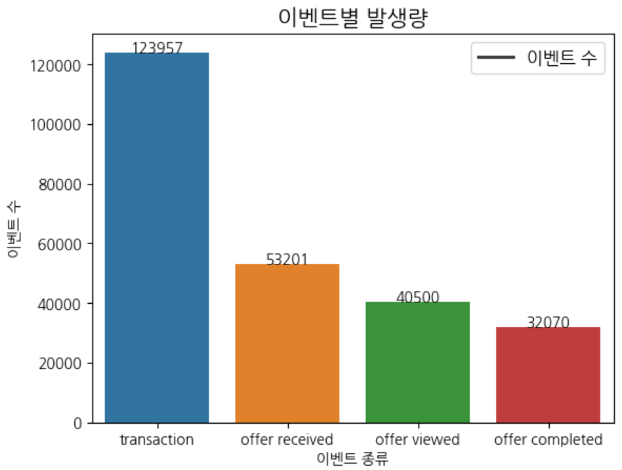
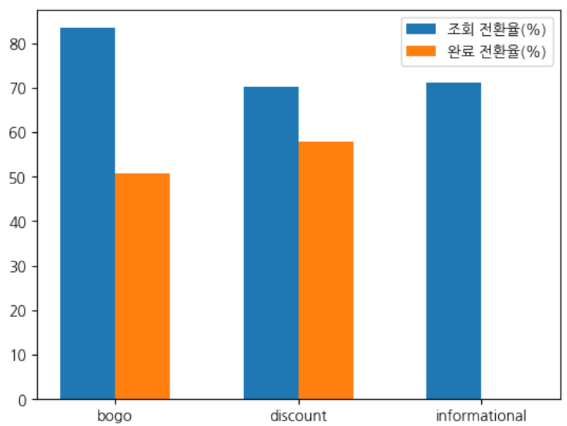
- 이벤트 발생 순서 확인 : 수신 → 조회 (생략 가능) → 완료/거래
- 특이사항 ) 고객이 프로모션 수신 후 `조회` 단계를 거치지 않아도 완료/거래 이벤트 발생 할 수 있음 ( 클로즈드 퍼널-closed funnel 형태로 추정 )
- 특이사항) 프로모션 완료 후에도 조회 이벤트 발생 할 수 있음.
- 각 프로모션의 마케팅 채널이 최소 2개이므로, 완료 이후에도 다른 채널을 통해 조회 할 가능성 이있음.
- 특히, email 채널이 포함된 경우, 완료 후 조회 발생 잦음
- 전체 전환율 : 수신대비 조회율 ( 76% ) 수신대비 완료율(44%) 조회대비 완료율(57%)
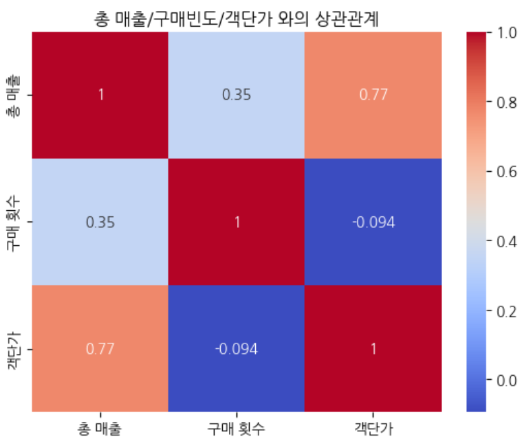
- 고객의 총 매출과 구매 빈도/ 객단가와의 상관관계 : 고객의 매출은 구매 빈도 보다 객단가에 영향을 더 많이 받음(0.77)
▼코드 보기
더보기
#프로모션별 전환율/이탈률/퍼널 이탈률 구하기
type_cnts = all.groupby(['offer_type','event'])['time'].count().reset_index()

pivot =pd.pivot_table(data=type_cnts,index='offer_type',columns='event',values='time')

type_cvr = round(pivot[['offer received','offer viewed','offer completed']].div(pivot['offer received'],axis=0)*100,1) #모든 값을 특정 값으로 나눌때 div
type_cvr= type_cvr[['offer viewed','offer completed']].sort_values(by='offer viewed',ascending=False)
type_cvr= type_cvr.rename(columns={'offer viewed':'조회 전환율(%)','offer completed':'완료 전환율(%)'})

#이탈률 추가
type_cvr['조회 이탈률(%)'] = type_cvr['조회 전환율(%)'] -100
type_cvr['완료 이탈률(%)'] = type_cvr['완료 전환율(%)'] -100

#퍼널 전환율 추가
type_cvr['퍼널 조회이탈률(%)'] = round(pivot['offer viewed'] / pivot['offer received']*100,1)-100

type_cvr['퍼널 완료이탈률(%)'] = round(pivot['offer completed'] / pivot['offer viewed']*100,1)-100

#출력
type_cvr = type_cvr[['조회 전환율(%)','조회 이탈률(%)','완료 전환율(%)','완료 이탈률(%)','퍼널 조회이탈률(%)','퍼널 완료이탈률(%)']].sort_index().reset_index().fillna(0)
# 구매 빈도, 평균 구매액, 객단가와 총 매출의 상관관계
#총 구매액 (고객당)
total_amounts = pro_trans.groupby('person')['value_amount'].sum().reset_index()
#총 결제 횟수(구매빈도)
total_cnts = pro_trans.groupby('person')['value_amount'].count().reset_index()
#구매액,구매 빈도 merge
merge_table = pd.merge(total_amounts,total_cnts,on='person')
#인당 객단가
merge_table['객단가'] = merge_table['value_amount_x']/merge_table['value_amount_y']
merge_table
merge_table = merge_table.rename(columns={'value_amount_x':'총 매출','value_amount_y':'구매 횟수'})
# 시각화
# 구매 빈도, 평균 구매액, 객단가와 총 매출의 상관관계
columns = merge_table[['총 매출', '구매 횟수', '객단가']]
# 상관계수 테이블
corr_matrix = columns.corr()
display(corr_matrix)
# # heatmap 시각화
sns.heatmap(corr_matrix, annot = True, cmap='coolwarm')
plt.title('총 매출/구매빈도/객단가 와의 상관관계')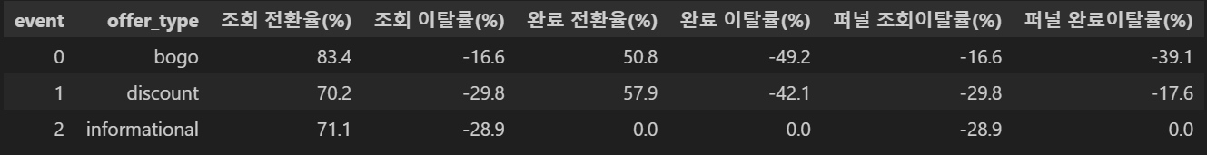
퍼널 분석
퍼널 분석 소개 핵클의 사용자 퍼널 분석을 통해 사용자가 서비스에 들어와 특정 목적을 이루기까지의 과정을 단계별로 분석 할 수 있습니다. 퍼널 분석의 단계는 이벤트를 활용하여 생성할 수
docs-kr.hackle.io